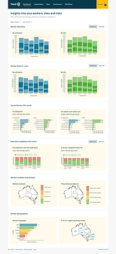
TALK5 Client Portal Analytics Dashboard
To support managers and other overseers to quickly understand the risks to their people, places and things across the business, a comprehensive yet simple analytics dashboard was designed.
The Solutions
At the end of the two week sprint, a hi-fidelity UI / UX design and prototype of a Analytics Dashboard focusing on people, places and risks within the TALK5 Client Portal to support managers to see and understand top data trends and risks for their teams as well as report upon the performance across the organisations operations.
This empowers leaders and managers across businesses to address and mitigate risks before they lead to accidents or injuries onsite.
As part of the Client Portal dashboard suite, Site and Contractor Dashboards were created too. These support Managers and other overseers to assess the top and low performing sites and contractors.
This enables the respective leaders and managers to address low performing sites and contractors while praising the ideal behaviours in the top performers.


The Unique Problem to Solve
Prior to these dashboards, the TALK5 client portal had very basic reporting and risk assessment capabilities, leaving managers in the dark and debilitating them from being empowered through knowledge. This dampened their ability to act with a clear strategy and driven by data insights.

Preparation
To kick off preparations, I reviewed the brief and wireframes drawn up of the graphs that the CEO had ideated should be included prior to my commencement with the business.


To acquaint myself with the best practices for designing and building an effective, insightful and purpose-driven analytics dashboard, I conducted desktop research and pulled together an inspiration document and a collation of design principles.
As a final step of preparation, I collated data from real customers to use within the dashboards as illustrative examples to bring the dashboards to life. These dashboards were highly admired by the customer and inspired in-depth discussions of how to drive home the value and have the greatest impact using the dashboard designs.
My Approach
My research provided me with a sound foundational understanding of how to design the flow and cohesiveness of the dashboard to best present managers and other users with clear data-driven insights to help them cultivate a culture of safety, care and proactivity.
Based on the hand drawn wireframes provided, digital versions were created moving into UX/UI hi-fidelity designs within Figma.
To really highlight the user’s interaction with the dashboard, a basic prototype was created showing the data shown when bars or columns in graphs were hovered over and how the view of data changes upon toggling view and filter buttons.
Before presenting them to the customer, peer reviews highlighted opportunities to iterate the designs with the intention to optimise the customer experience.
These designs were tested with the customer, who felt they would solve a lot of their existing problems and invited us to collaborate further to really evolve the dashboard designs to best suit their needs.
Demos of the designs were presented to the whole organisation to collect feedback and seek alignment on how we can best present data to users in a way that genuinely solves their problems and makes their lives easier, thus improving the safety of their workplaces.
I documented all of the variants of screens, potential interactions and flows that a user may experience when using the client portal analytics dashboard to support the future designs and build of the platform (at this stage, I was asked to kick off the second design sprint: designing the Worker App.
Challenges to navigate
Tight timelines
Tight turnarounds led to limited opportunities to seek customer feedback across various iterations of the designs. This left a risk of delivering something that is relatively effective but had potential to offer a seamless, enjoyable experience regardless of the specific customer need.
Miscommunication
Miscommunication within the team resulted in time being dedicated to designing the entire client portal analytics experience with extremely tight deadline expectations.
What I'd do differently if given the chance
Test, test, test
If we had the luxury of more time, more customer testing would have optimal in order to ensure our designs was genuinely achieving the users’ jobs to be done and meeting their various reporting and review needs.
Confirmation on scope of work
If I had the chance, I would have sought confirmation on the scope of work and timeline expectations to avoid dedicating ample time and effort to design all variations of the screens and interactions a user may have.